Simple.
A big part of our commitment to Honestly Good Banking is keeping things simple. Our products, services and experiences should be simple. The way we speak should be simple. And even the way we visualize our brand should be simple.
This helps convey a sense of ease and comfort.
Honest.
Honesty is easy. Until it's not.
Sometimes telling the truth is hard and hearing it is even harder. But we’re committed to it either way. And we believe honesty is a two-way conversation. So we promise to listen to what our customers and our associates have to say, whether it’s a compliment or a complaint.
Neighborly.
If we’re going to do business in a community, we intend to contribute to that community as much as any neighbor would. Because that’s what good neighbors do. They lend a helping hand and they do it with a smile on their face.

Logo
Please contact Simmons Bank Marketing for logos and approved uses by emailing
marketing@simmonsbank.com.
Standard (preferred option)
FDIC
In many instances, the product or service being promoted is FDIC-insured, such as deposit products (i.e. checking, savings, CDs). For products and services not backed by FDIC, such as investments, trust and insurance, a different logo is required. Please contact marketing@simmonsbank.com if you have questions or need assistance.
Standard FDIC (preferred option)
Standard FDIC w URL
Color and Spacing
Reversed-out logo
Single color logo
Logo spacing
The letter “i” in Simmons is the scale for the distance.
The space from the outer edge or the bug to the text (with or without the white rule) should always be two of the letter “i”.
The scale (2x letter “i”) would be measured from the edge of the white rule to the “Simmons Bank” text.
When using the stacked Simmons Bank logo, the “Simmons Bank” text should be scaled where the remaining distance above and below “Simmons Bank” is 1x above and below the text, where the letter “i” is flush with the top and bottom of the S1 bug.
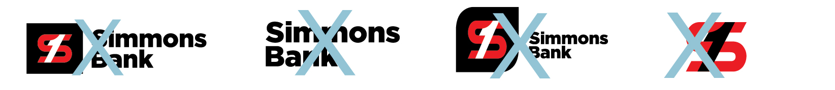
Do NOT:
- Separate S1 bug and logotype or replace it with other shapes or icons.
- Rotate or disproportionately stretch any parts of the logo.
- Make the S1 bug larger than logotype.
- Remove logotype from logo box or choose a new shape.

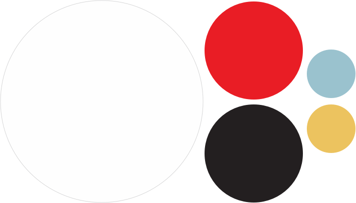
Simmons Red
Red is the heart of our brand. This color draws attention to key focal points, interactive elements in digital, and achieves the overall desired color balance.
PMS: 2035C
CMYK: 1, 100, 100, 0
HEX: #DC061B
RGB: 220, 6, 27

Black
Black is primarily used for type.
It can be overly dominant when used in large areas or quantities. Use our secondary dark gray in these situations.
PMS: Black
CMYK: 0, 0, 0, 100
HEX: #000000
RGB: 0, 0, 0

White
White is our most effective tool for softening up our bold, primary red and black colors.
Using white for backgrounds and large areas creates white space—keeping our materials feeling light, fresh and welcoming.
PMS: White
CMYK: 0, 0, 0, 0
HEX: #FFFFFF
RGB: 255, 255, 255

Dark Gray
Our secondary gray has been introduced for situations where we need large amounts of black, such as background areas. Use of this secondary gray helps maintain the feel of our primary colors without the dominant nature of our primary black.
CMYK: 8, 0, 0, 90
HEX: #353A3D
RGB: 53, 58, 61

Light Gray
Our secondary light gray is used only for backgrounds when white might feel too sterile. The light gray adds warmth, and can work in conjunction with white to delineate content areas.
CMYK: 0, 0, 0, 7
HEX: #F5F5F2
RGB: 245, 245, 242
Note: In print, different percentages of the light gray may be used to achieve necessary contrast.

Blue
Our secondary blue is the recommended choice when additional color is needed. As a secondary color, it should not be used in large quantities, such as backgrounds. Use our blue for visual accents, charts, illustrations and design elements.
PMS: 4156 C
CMYK: 40, 8, 10, 3
HEX: #9BC3CE
RGB: 155,195, 206

Yellow
Our secondary yellow should be used only sparingly as an accent color, or in charts. It should never be used with red and black/gray on its own, to avoid confusion with Mastercard. This color should be used only in conjunction with our secondary blue.
PMS: 4017 C
CMYK: 5, 22, 81, 4
HEX: #EDC35F
RGB: 237, 195, 95
Type
Our approach to typography is bold and simple. Always sentence case.
Title here lorem ipsum.
Subtitle sed ut perspiciatis unde omnis iste natus error sit voluptatem.
Body copy. Cras non ornare orci. Maecenas velit magna, condimentum sit amet vulputate id, lobortis sit amet arcu. Ut molestie sagittis commodo. Donec ipsum nulla, elementum in nisl non, iaculis elementum nisi. Quisque pharetra nisl urna, eu sollicitudin lectus rutrum eget. Aliquam quis augue mi. Fusce commodo magna nunc.
Mauris aliquet porttitor pretium. Sed vitae pulvinar nisi. Praesent faucibus ex felis, luctus finibus lectus tincidunt mollis. Donec accumsan tellus nunc, in ac-cumsan enim egestas ac. Fusce nec mauris rhoncus eros aliquam elementum. Nullam aliquet gravida eros, eu aliquet risus posuere.
Lifestyle photography
Lifestyle photos shouldn’t feel staged or “forced” for that perfect moment. These photos should be realistic and give the feeling of real life. The photography should capture the joy of the moment. It should feel like a photographer just came along for the ride, capturing events as they unfolded.

Portraits
In many cases, such as a small business profile, the environment helps tell the story. The photos should feel candid—not posed or with the person smiling at the camera.

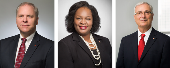
Corporate headshots
For corporate headshots, backgrounds should attempt to match the Simmons Bank gray color for consistency. Clothing with busy patterns should be avoided. If the Simmons Bank pin is worn, it should be on the left lapel.
Headshots should not include the environment or use different backgrounds. Also, avoid unconventional angles.
Illustration
Illustrations are used as an alternative to photography. As part of the brand, it’s important that our illustrations follow best practices—always be consistent with use of color and illustration style.


When creating illustrations

When creating illustrations, start with the horizon line to anchor the illustration, and an optional background shape to help define the area of the illustration.

The illustration should be made using solid shapes and minimal lines. The use of color is very intentional—red is used for a focal point, dark gray and blue for larger areas of color, and only a small accent of yellow.

As a last step, people are added to create interest and a unique twist. The people should be engaging with the illustration in some way whenever possible. The placement of people is in front of the horizon line, with a drop shadow.
Animation & illustrations
Illustrations can be animated to capture attention and introduce visual interest. Keep animations under 3 seconds.
Red and Blue:
Example:

Reversed-out:

Example:

Stepping stones
Photography lockup
To be used when you want to represent a life moment or life stage: the photography lockups are the preferred option versus the no-photography lockups.
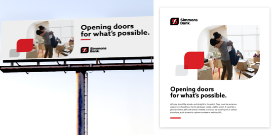
Showcases a life moment and creates visual hierarchy.

Photography lockup 1

Photography lockup 2

Photography lockup 3

Photography lockup 4

Photography lockup 5

Photography lockup 6
Always bleed at the top-left of artboard

Photography lockup 7
Always bleed at the bottom-right of artboard
No-photography lockup
Choose this option when the messaging is broad, copy heavy, or when photography is not appropriate (such as a letterhead or envelope). No-photography lockups are to be used as accent pieces, or to guide the reader’s eye—a complement, but not the focal point.
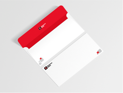
Envelope has ample whitespace and lockup is used as an accent.

No-photography lockup 1

No-photography lockup 2

No-photography lockup 3

No-photography lockup 4

No-photography lockup 5

No-photography lockup 6
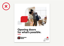
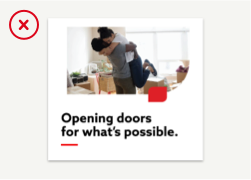
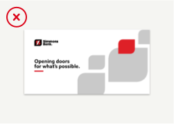
Never use photo lockup and no-photography lockup in the same creative.
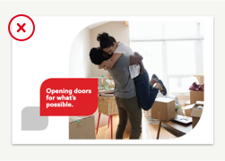
Never alter or transform the lockups. Do not add copy or other elements to overlay the lockups.
This lockup needs to bleed to the upper-left corner.
This creative could use the photography lockup. Bleeding the lockup is ok, but the no-photography lockup is too large and not serving as an accent.
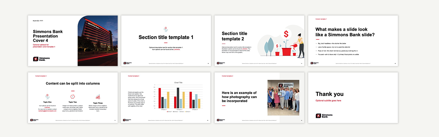
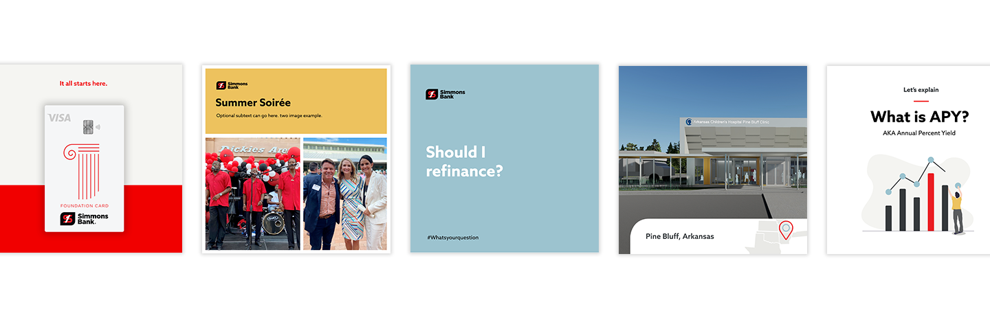
Sample work
This is a carousel with auto-rotating slides. Activate any of the buttons to disable rotation. Use Next and Previous buttons to navigate.

Honestly good banking.
simmonsbank.com
© 2021 Simmons Bank Member FDIC